Hi, I’m Sijia, a graphic designer specializing in branding, interaction design, and typography.
Welcome to my world :)
07 Xi: Spiced Baijiu Brand
︎︎︎ Package DesignGraphic Designer
The Underneath
01.2025-04.2025
︎︎︎ Spatial Design
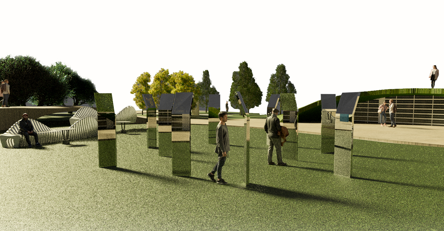
︎︎︎ Installation
︎︎︎ Exhibition Design
︎︎︎ Installation
︎︎︎ Exhibition Design
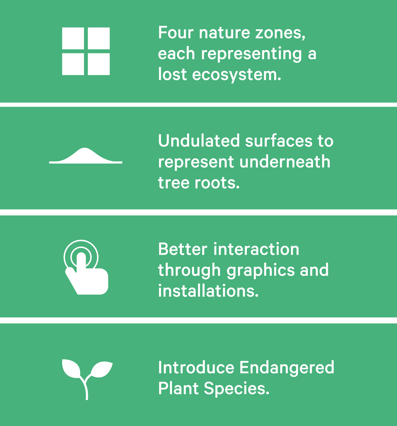
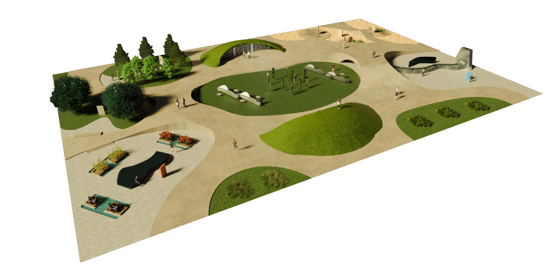
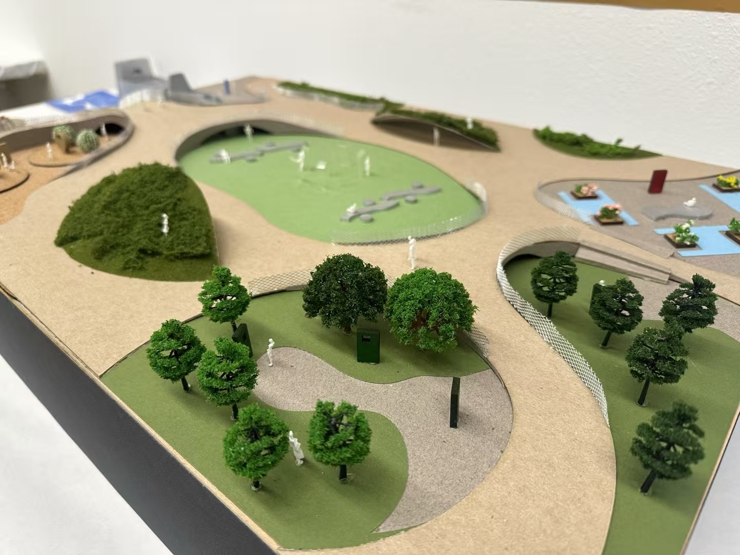
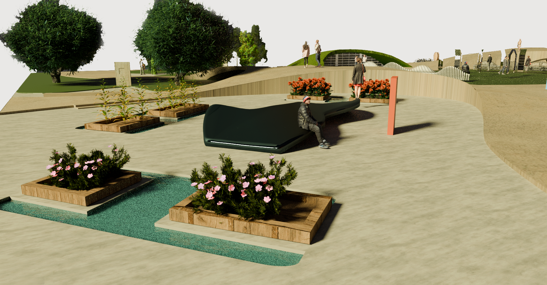
Urbanization triggered a major shift from rural to urban living, leading to significant loss of nature. Once-thriving natural landscapes have been buried under concrete, and the consequences are now threatening our health, comfort, and long-term well-being. This project is a redesign of Pershing Square park at downtown LA, aiming to restore the nature that existed before being replaced by urban infrastructure. This renovated space offers an ecosystem for movement and connection, highlights nature’s importance in urban life, and encourages a collective commitment to environmental preservation.
︎︎︎ Site Research ︎︎︎ Design Approaches
Pershing Square is a historic public park located in the heart of Downtown Los Angeles. Surrounded by high-rise buildings and busy streets, it is a poorly maintained central gathering space for the community.
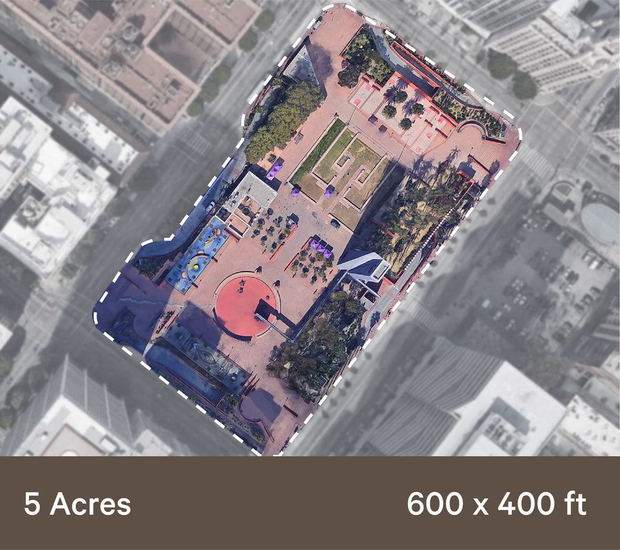

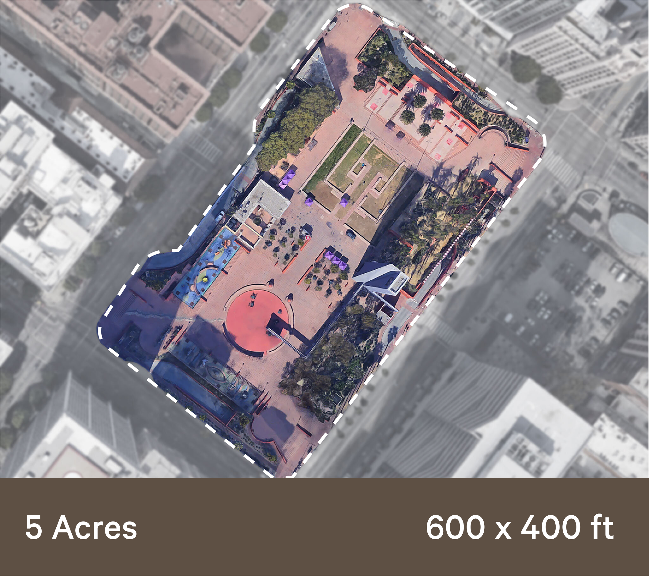
The mission is to restore the nature that existed before being replaced by urban infrastructure. This renovated space will offer a ecosystem for movement and connection, highlight nature’s importance in urban life, and encourage a collective commitment to environmental preservation.

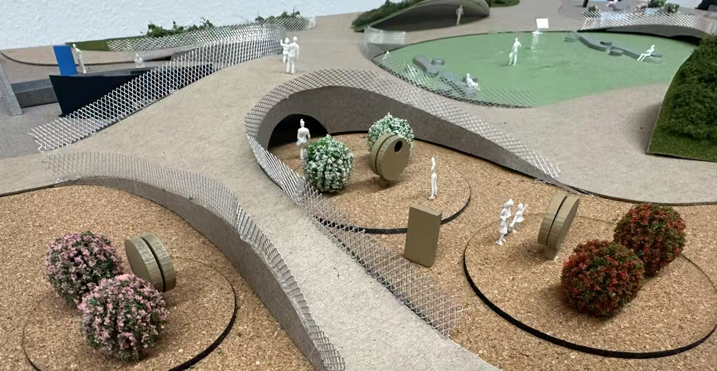
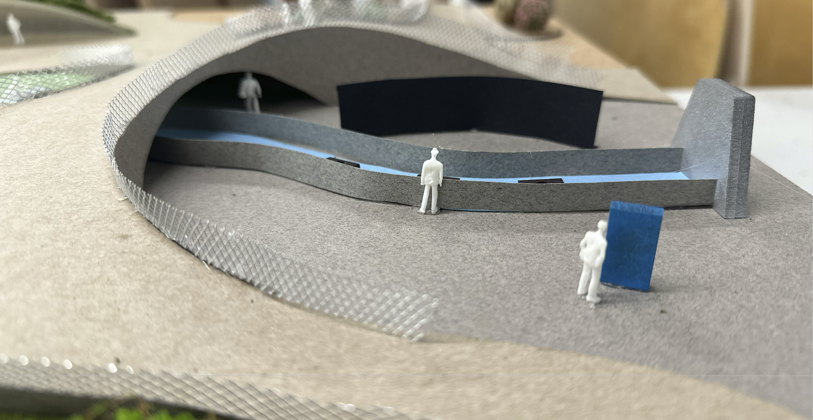
︎︎︎ Site Modeling + Prototyping
![]()
![]()
![]()
![]()
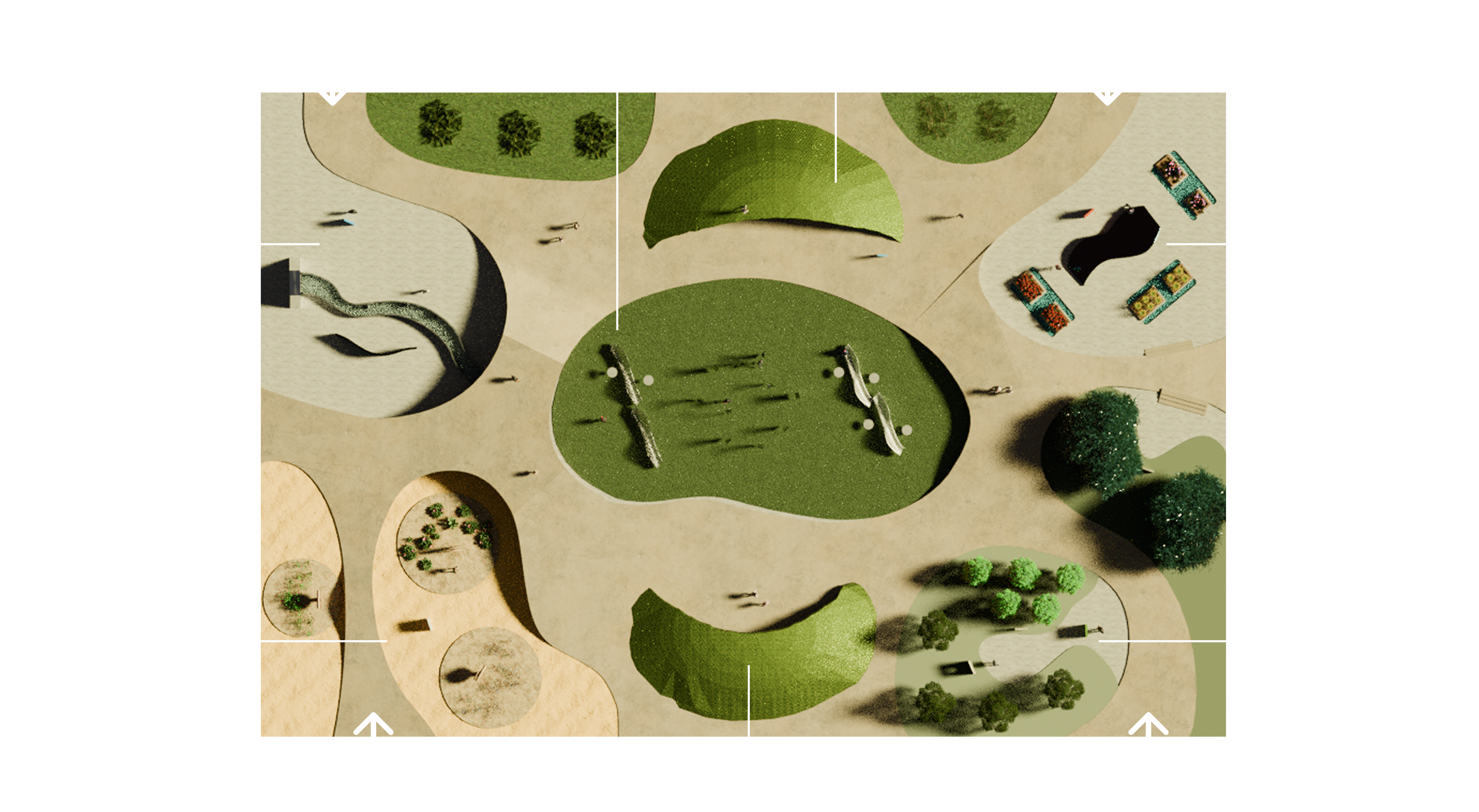
︎︎︎ Zone Design
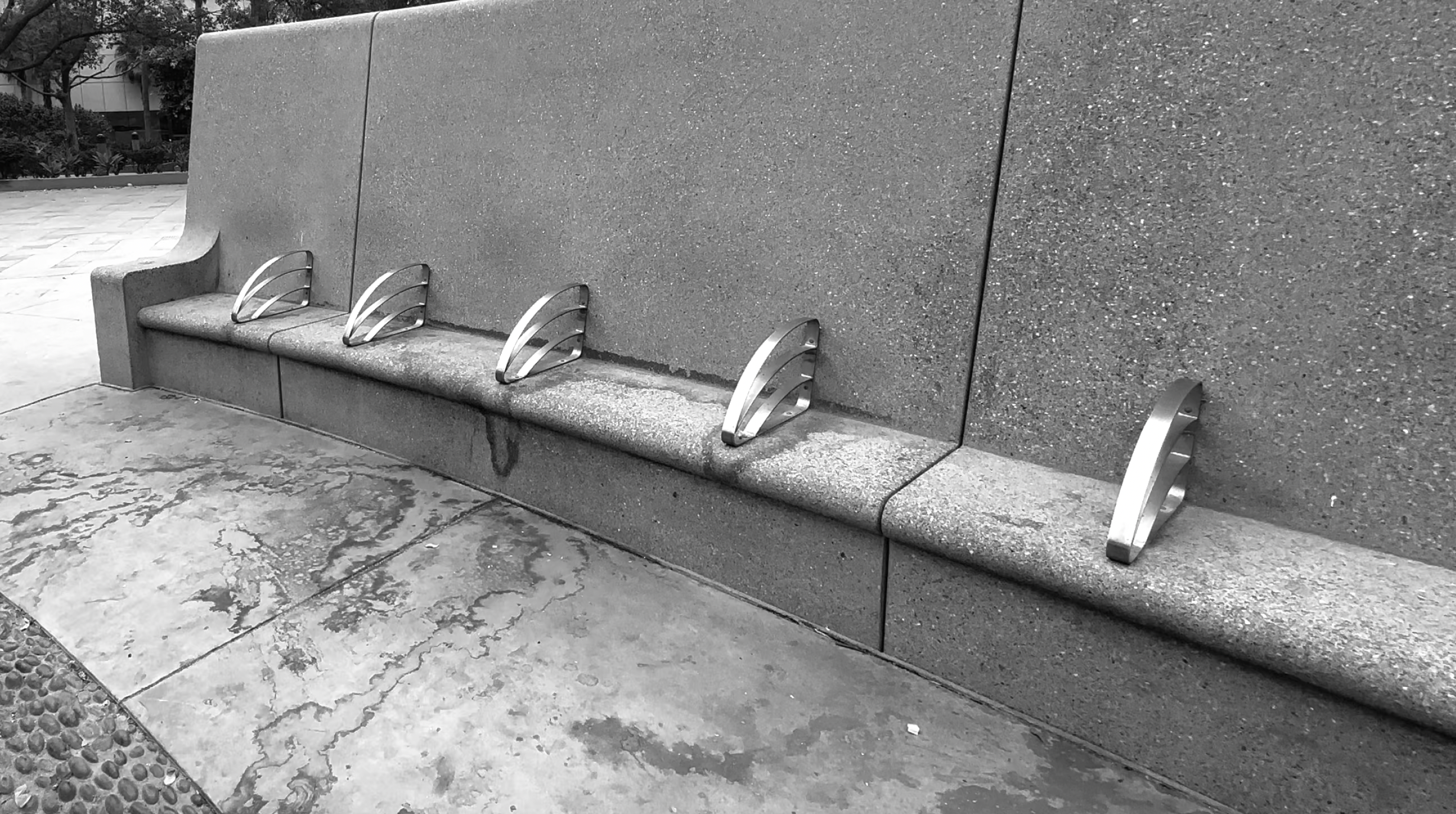
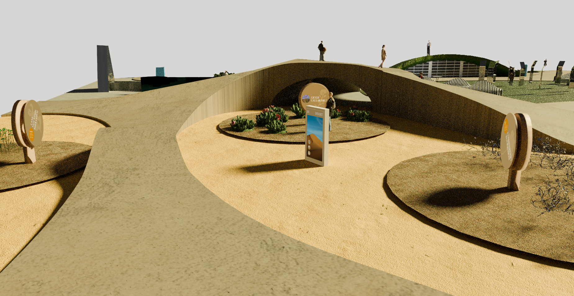
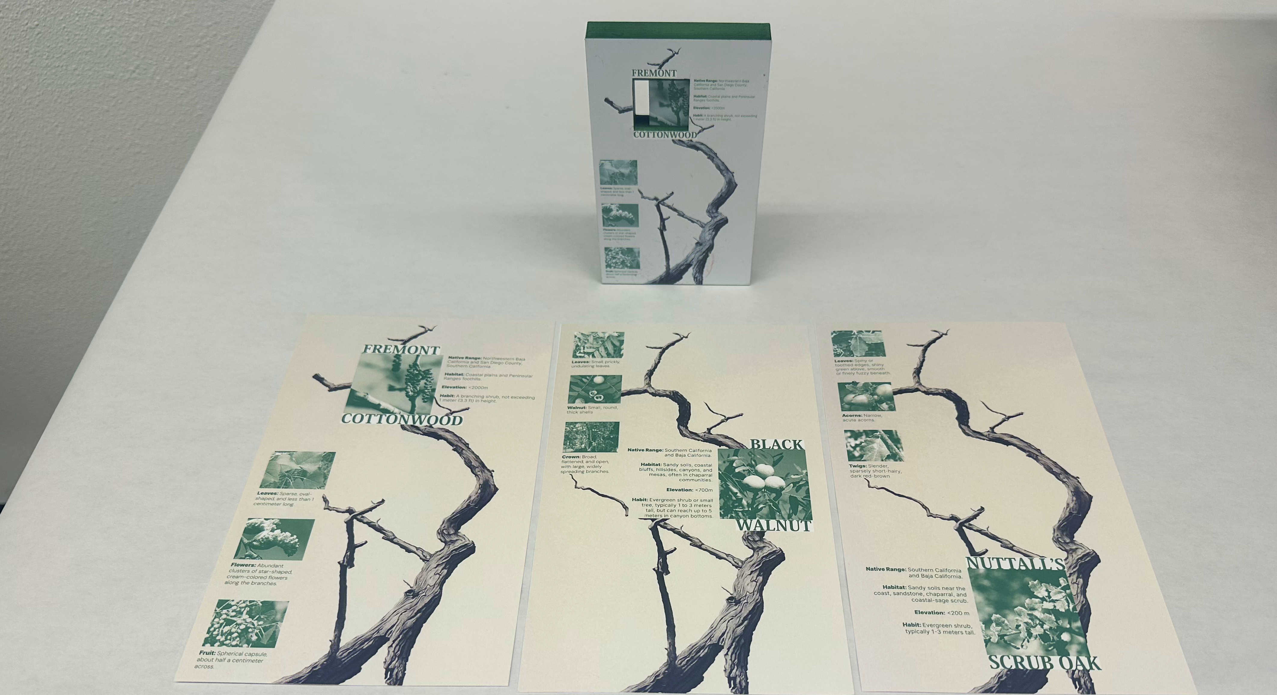
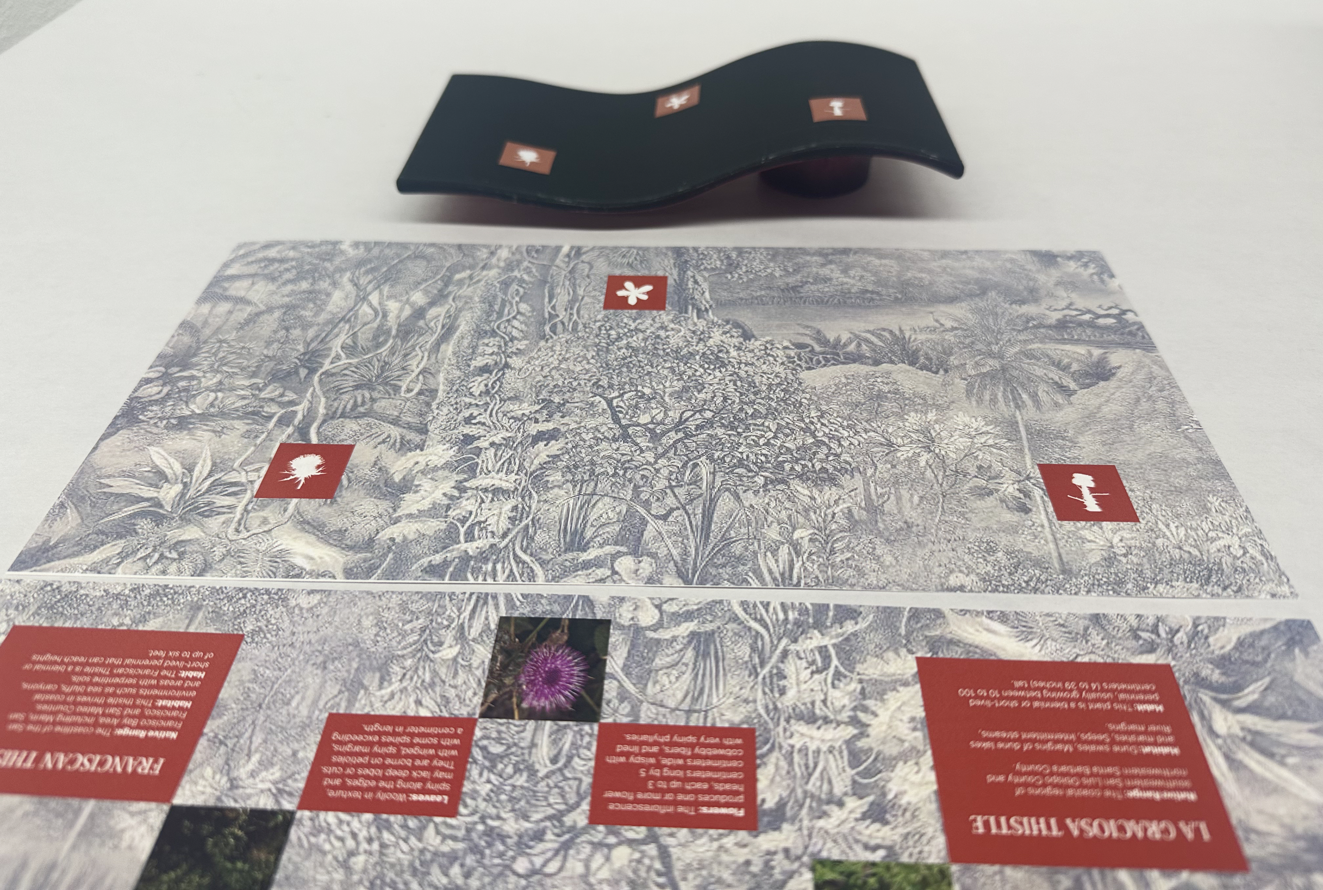
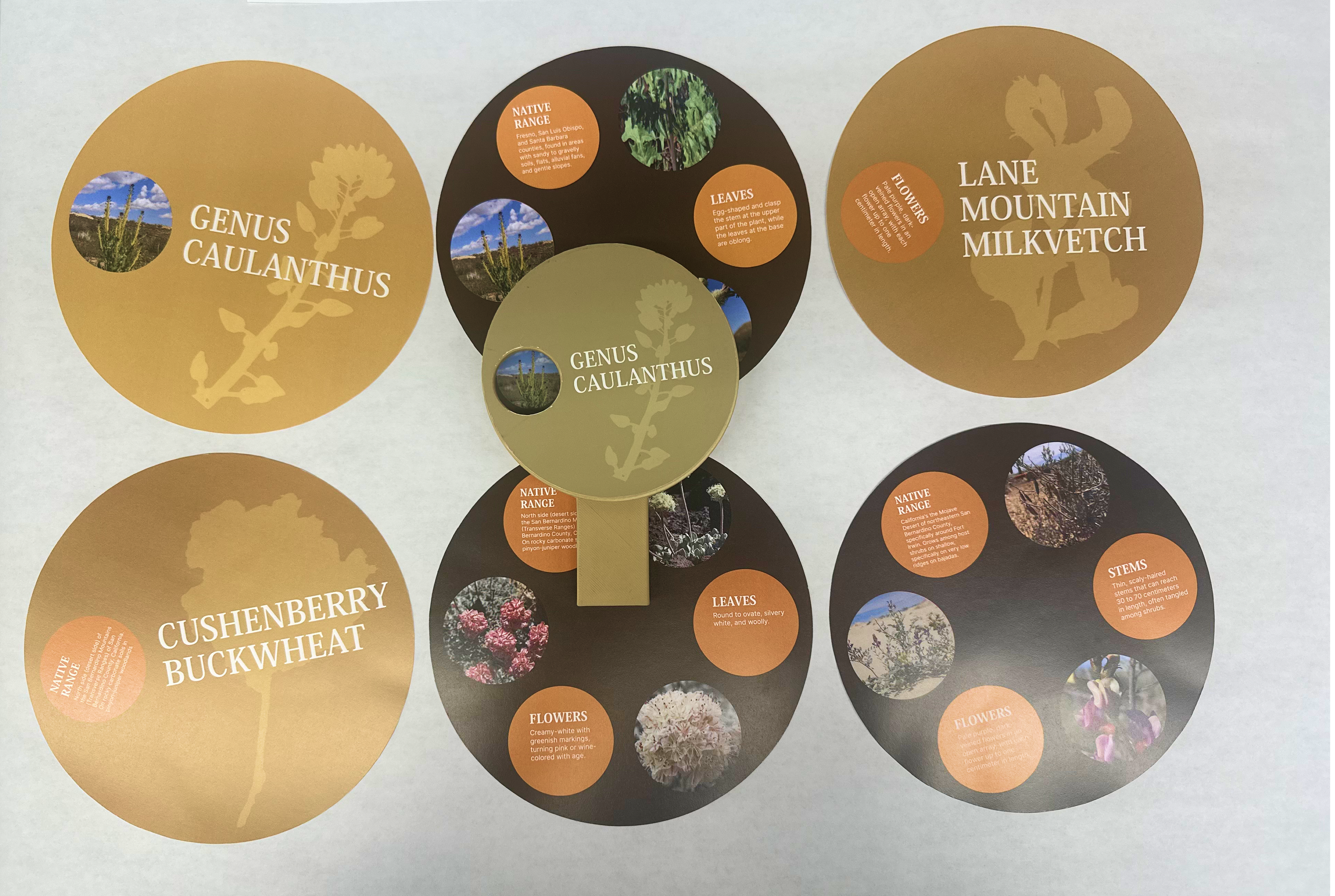
︎︎︎ Installation 3D Printing & Information Design
![]()
![]()
![]()
![]()
︎︎︎ Promotion


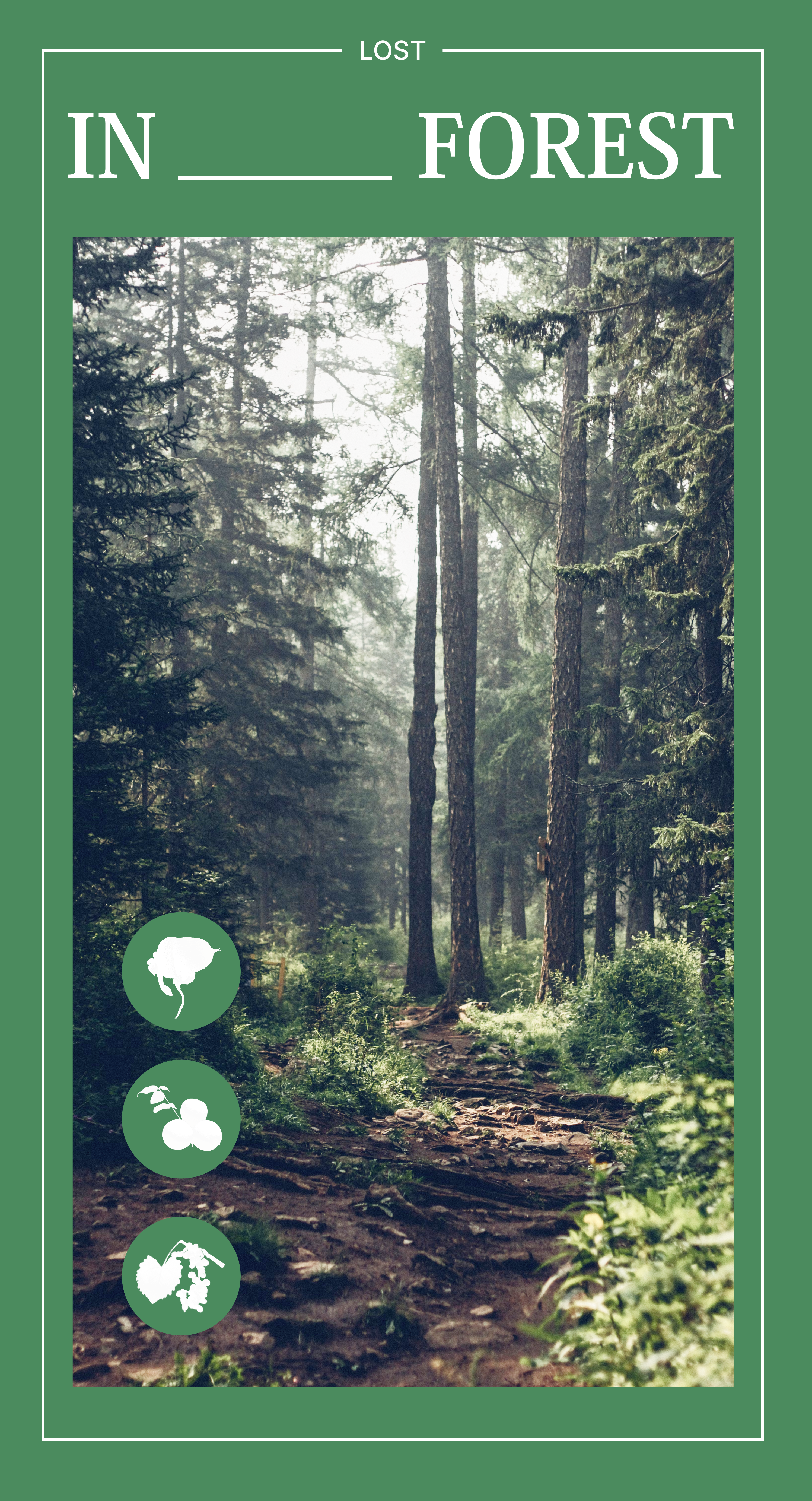
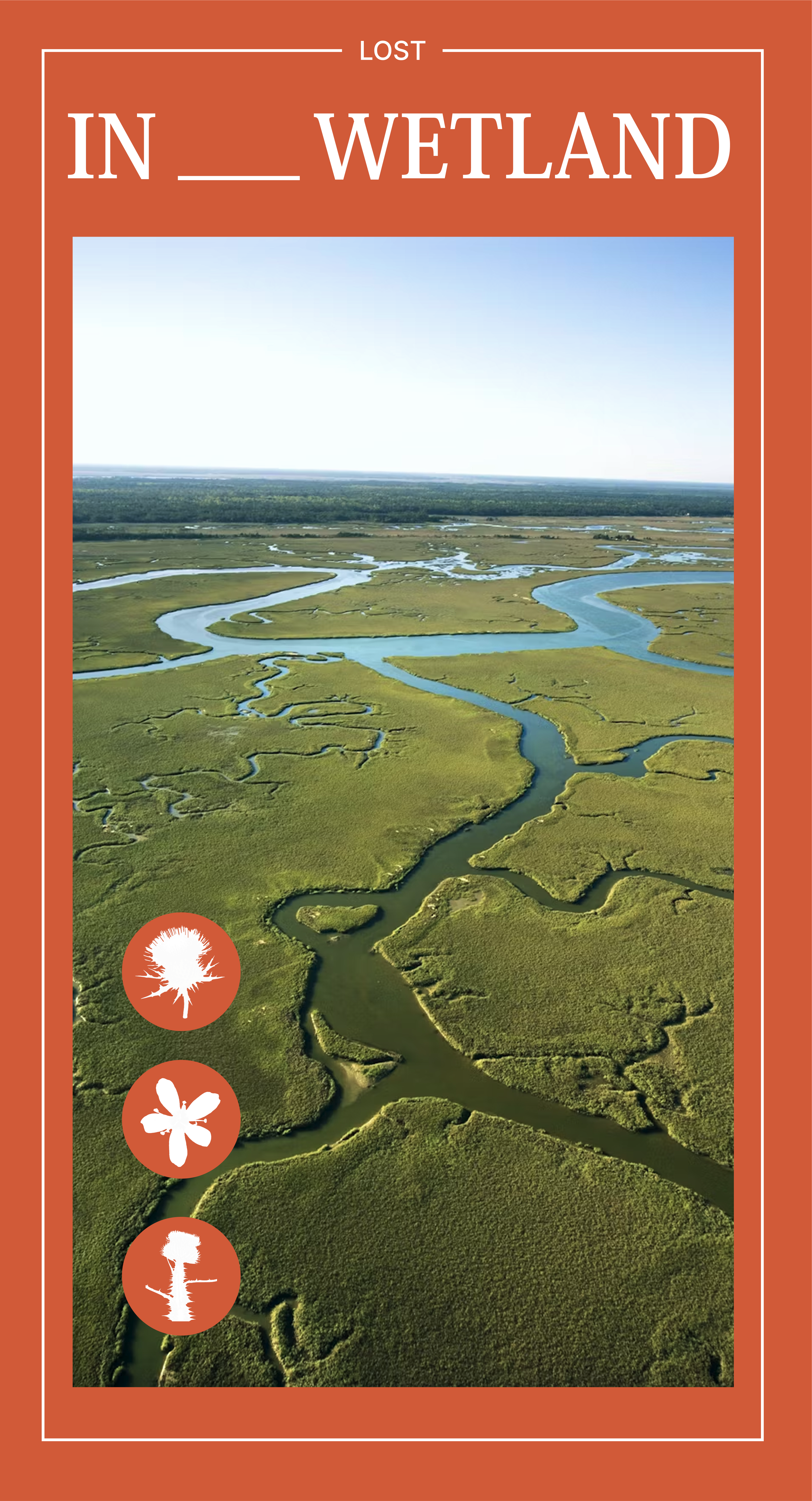
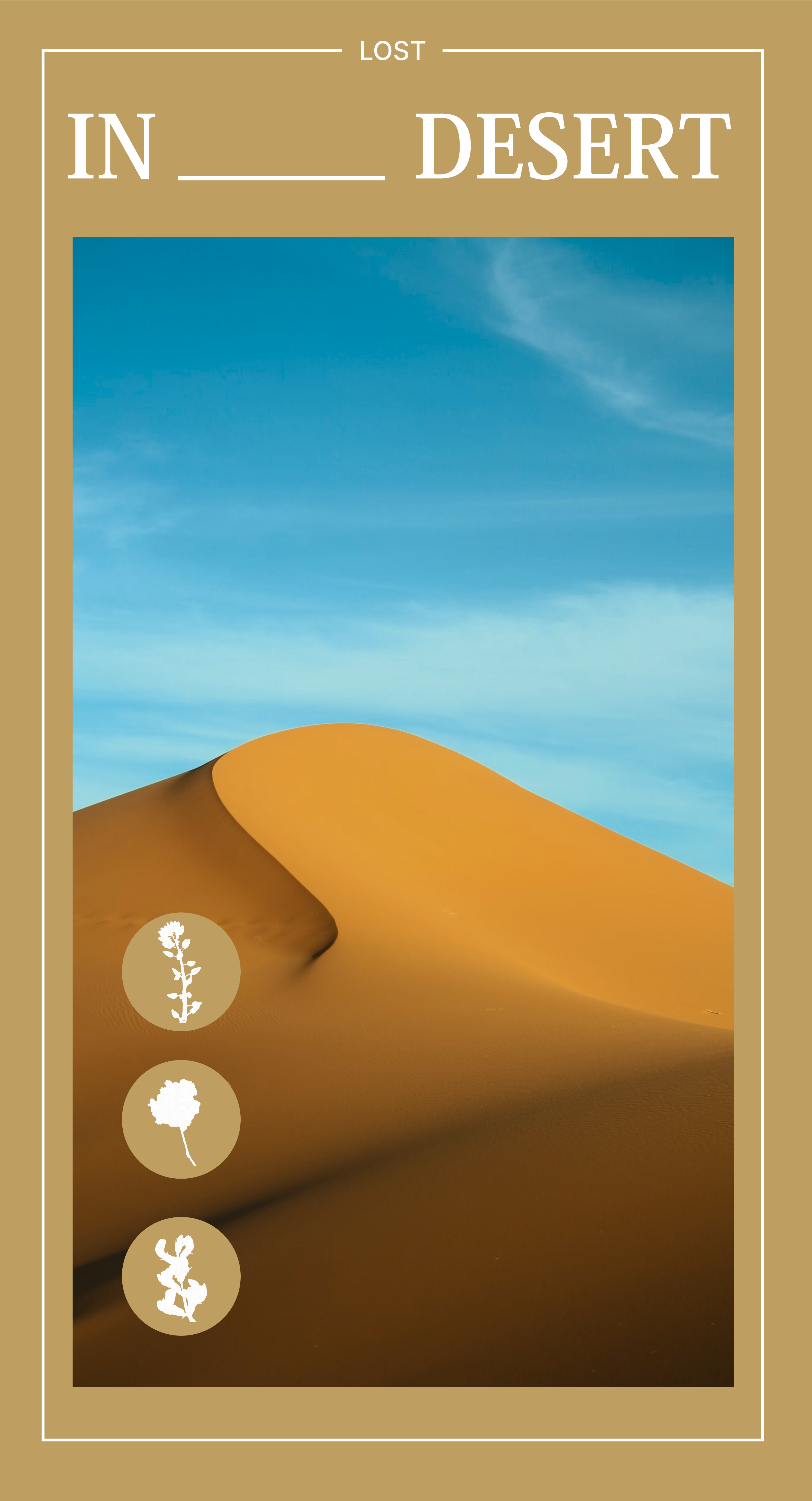
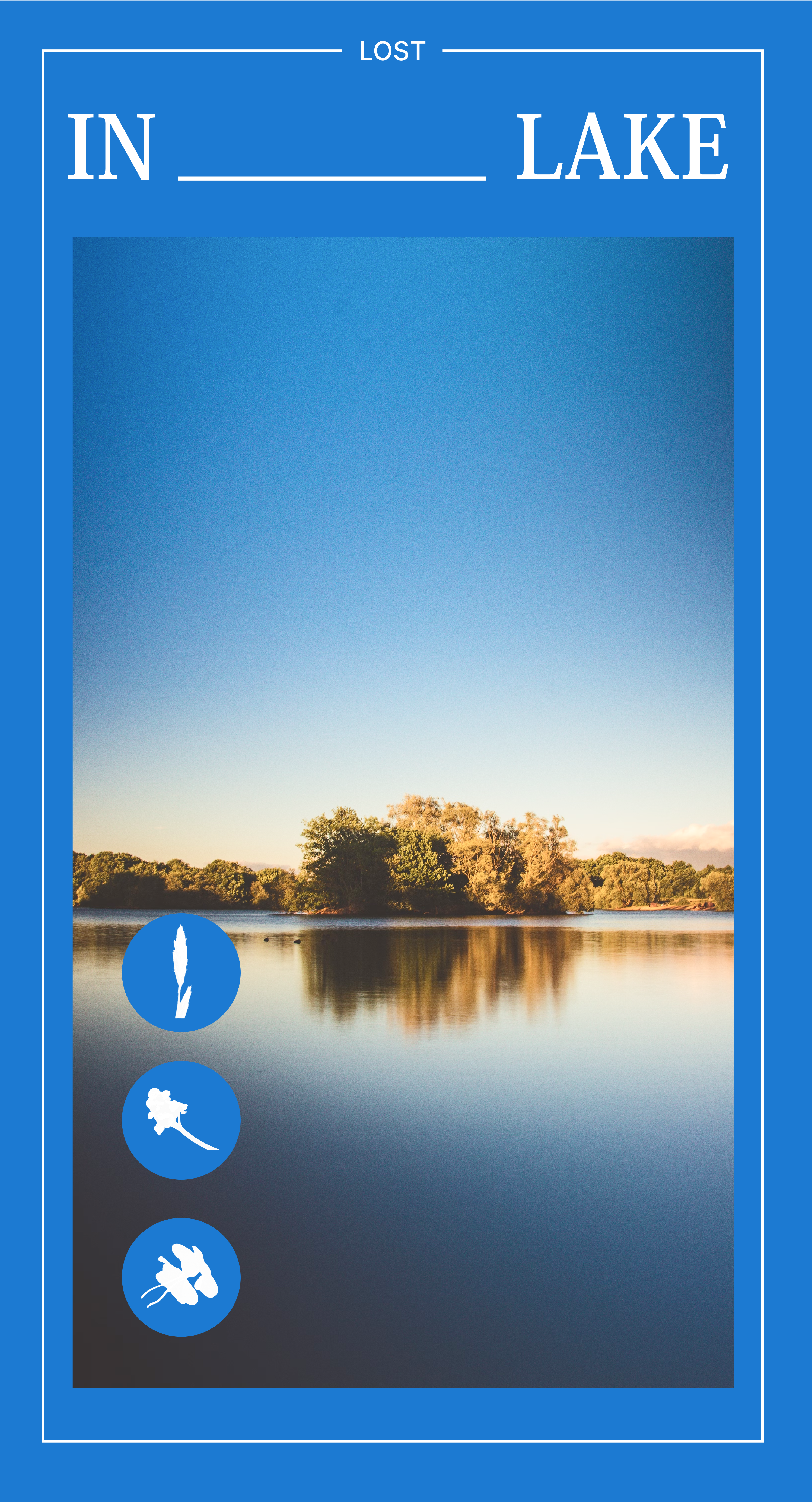
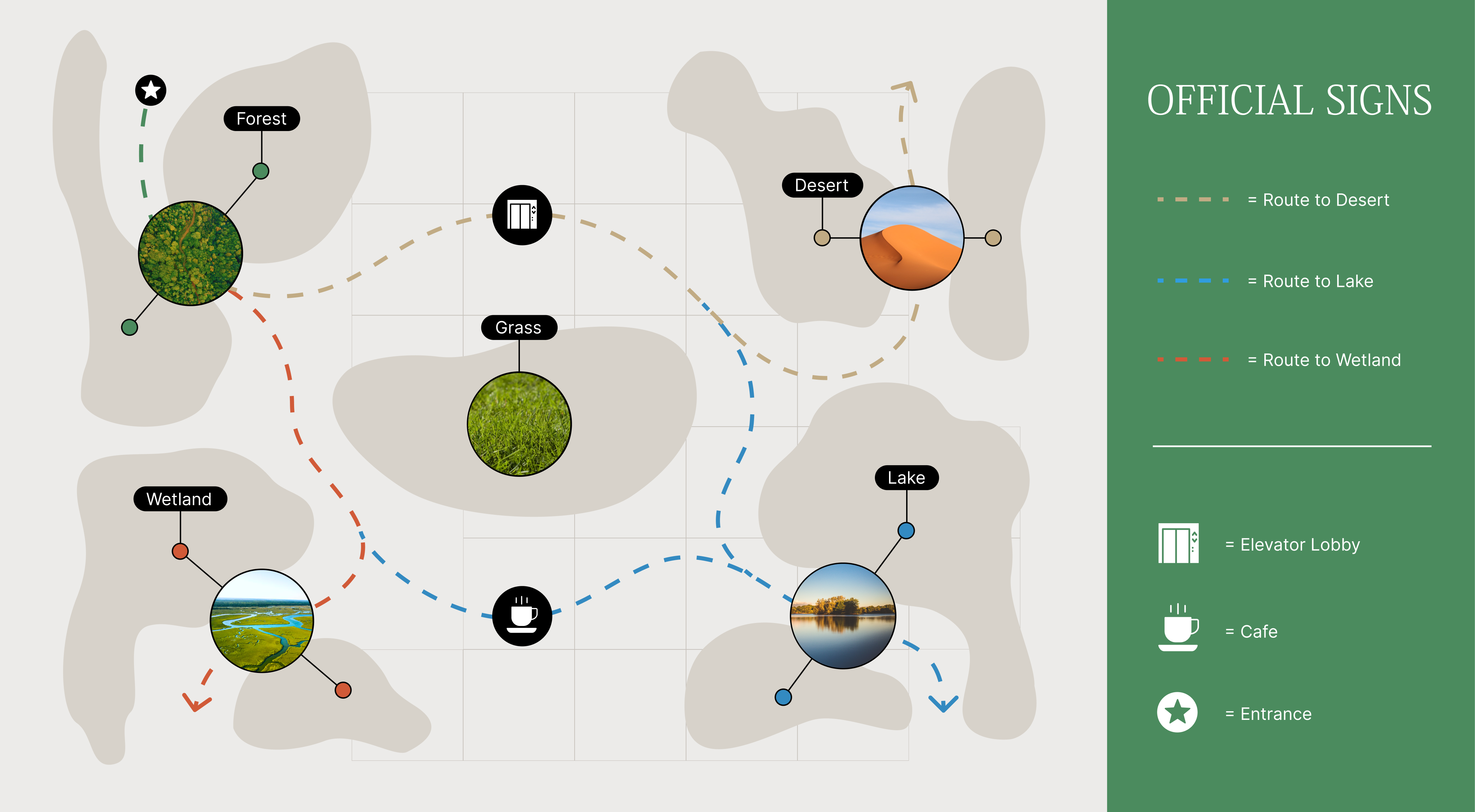
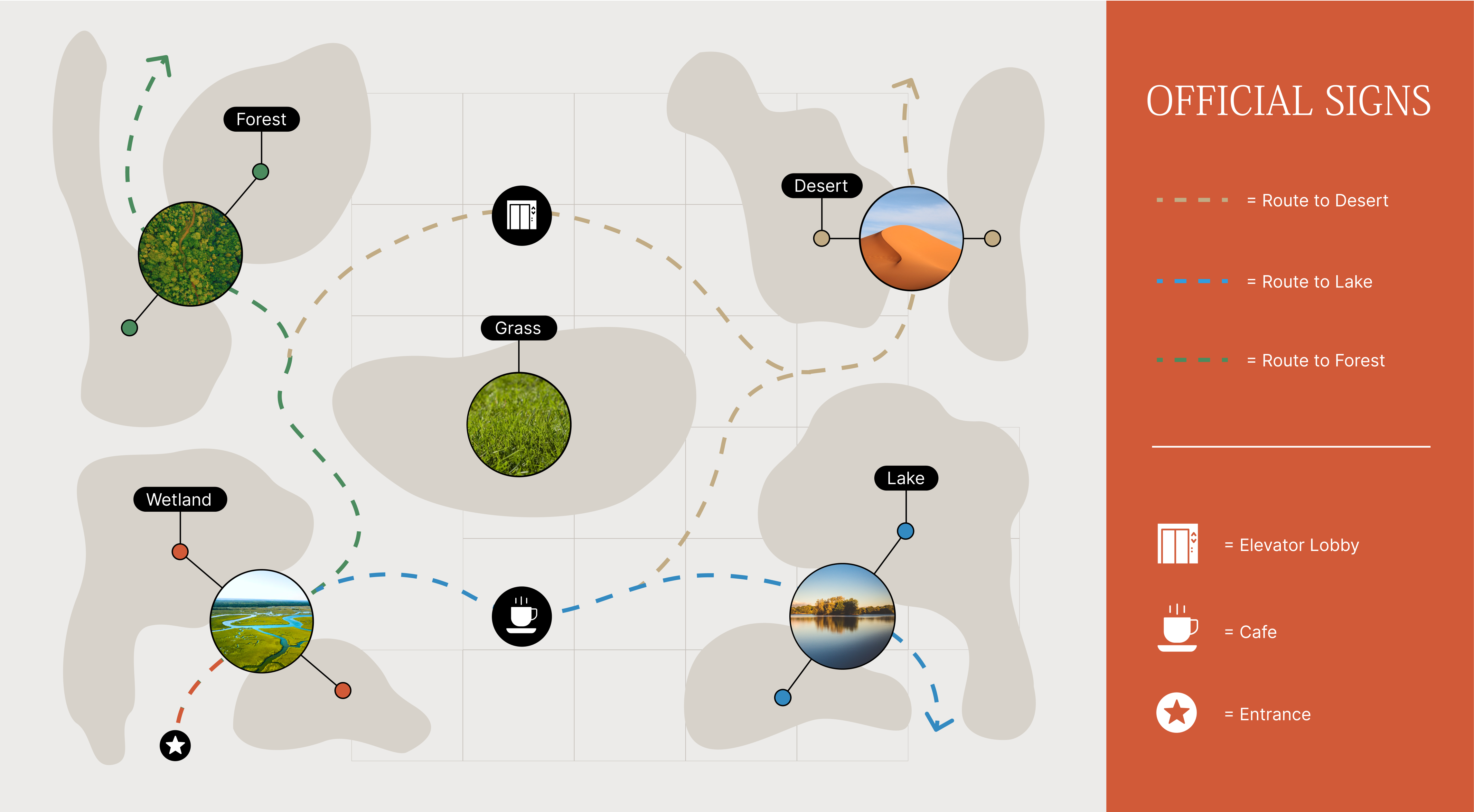
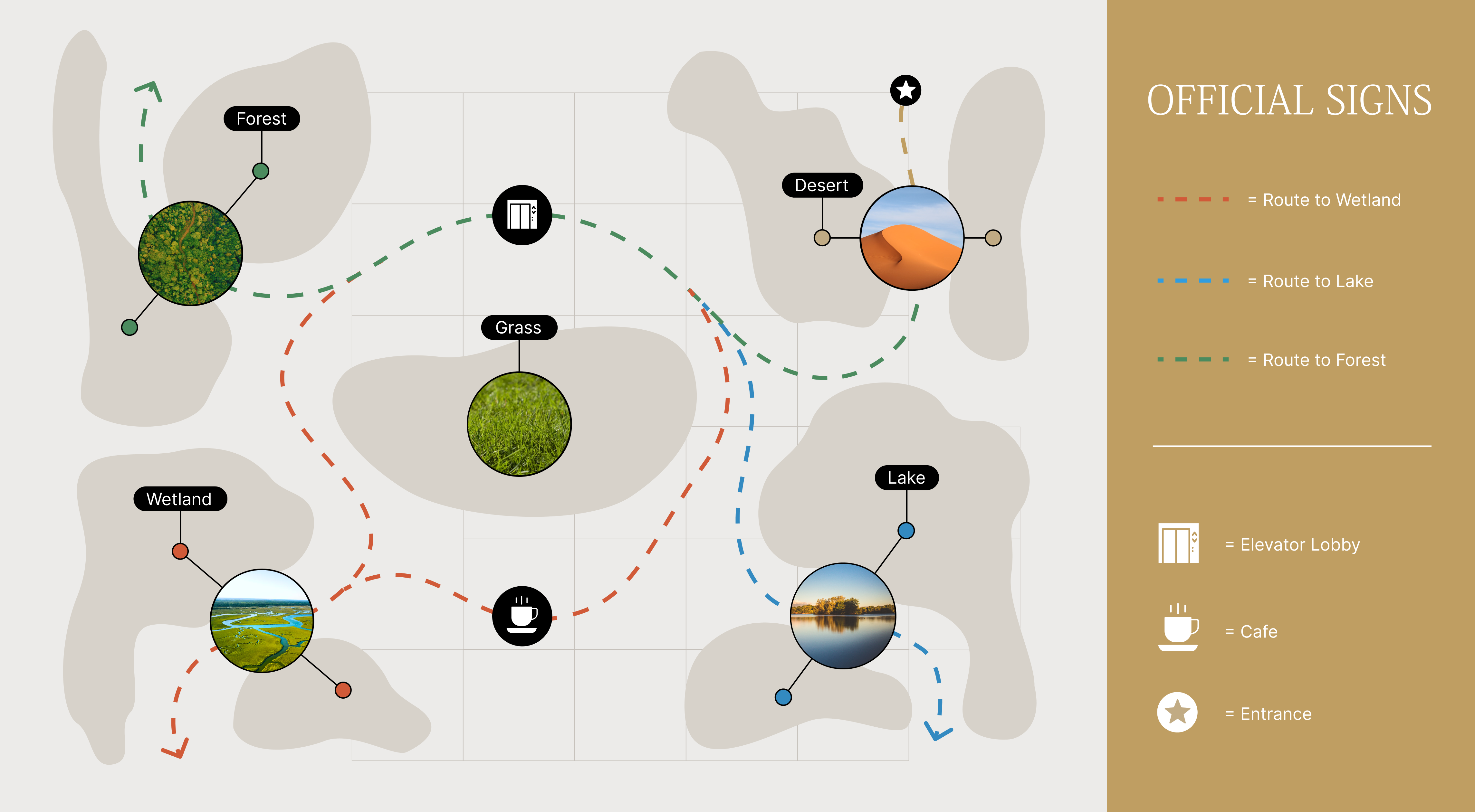
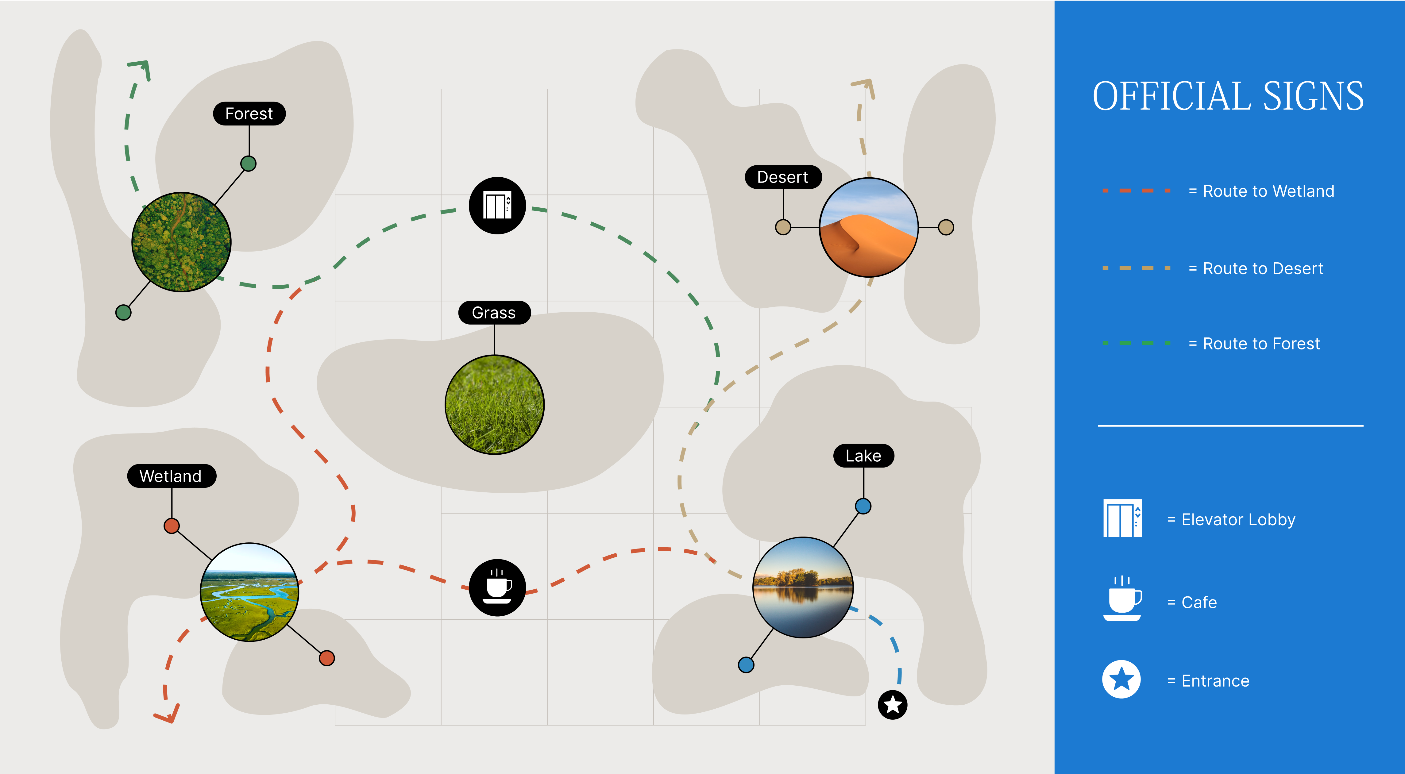
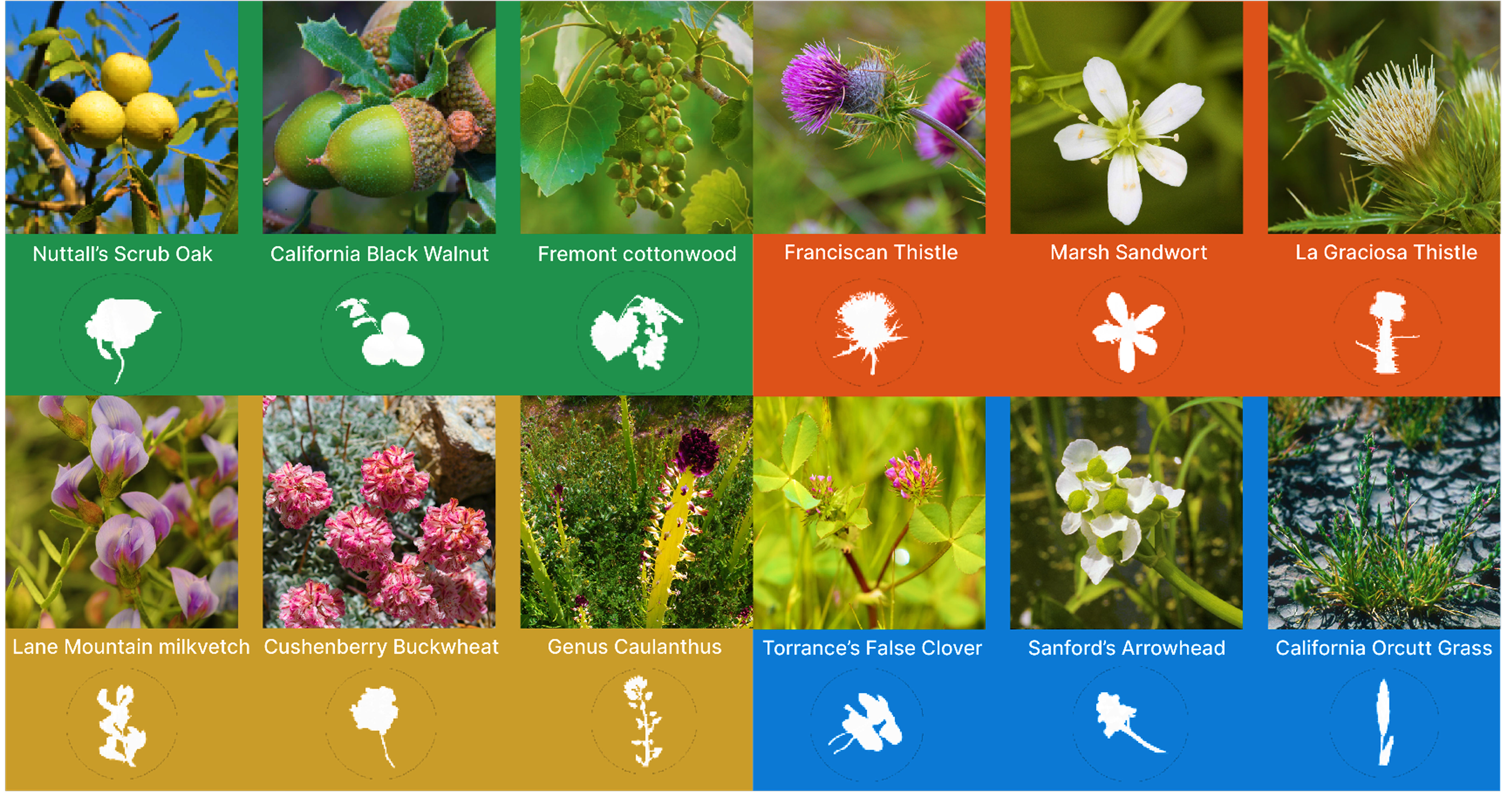
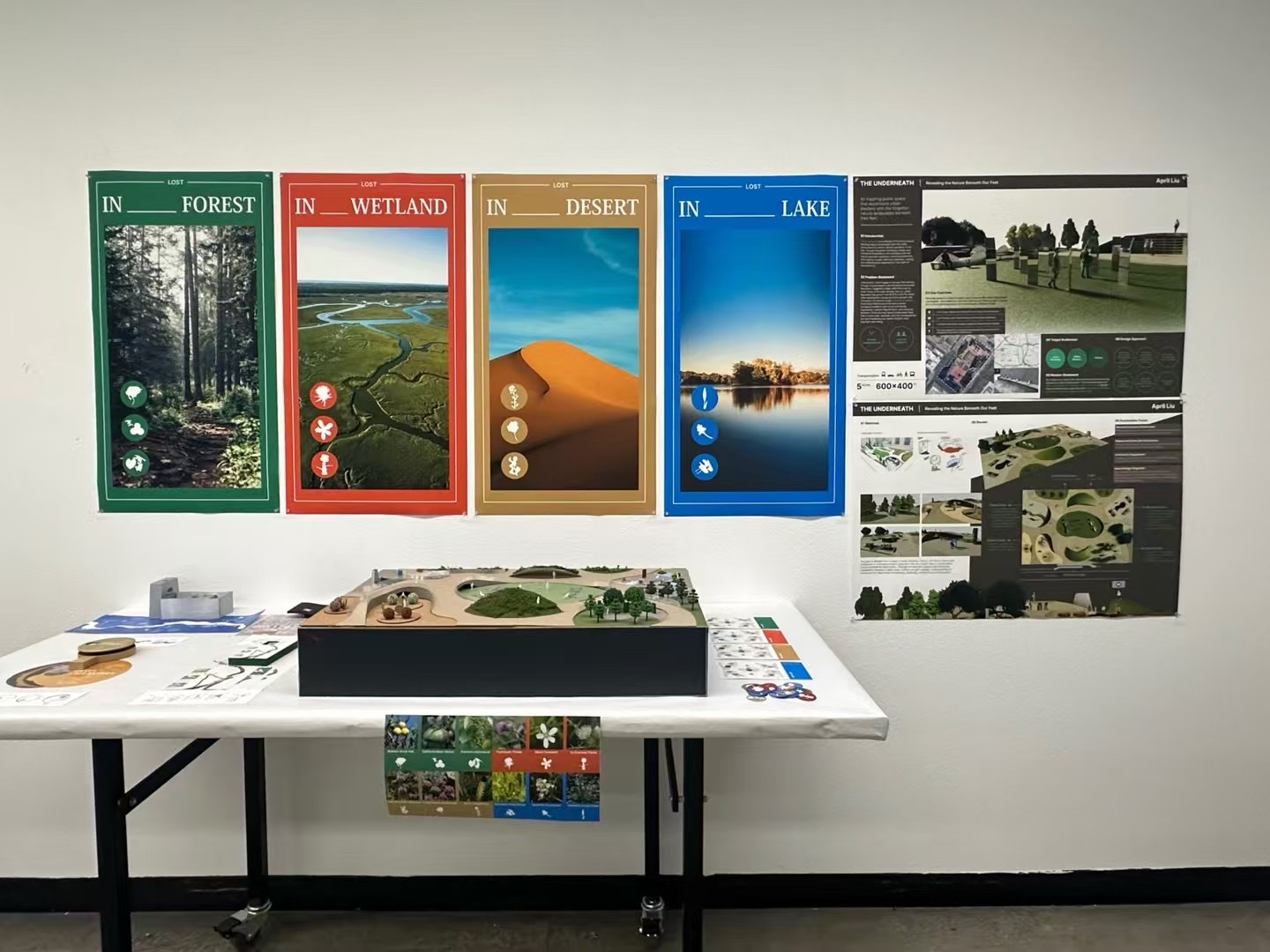
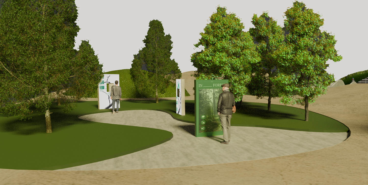
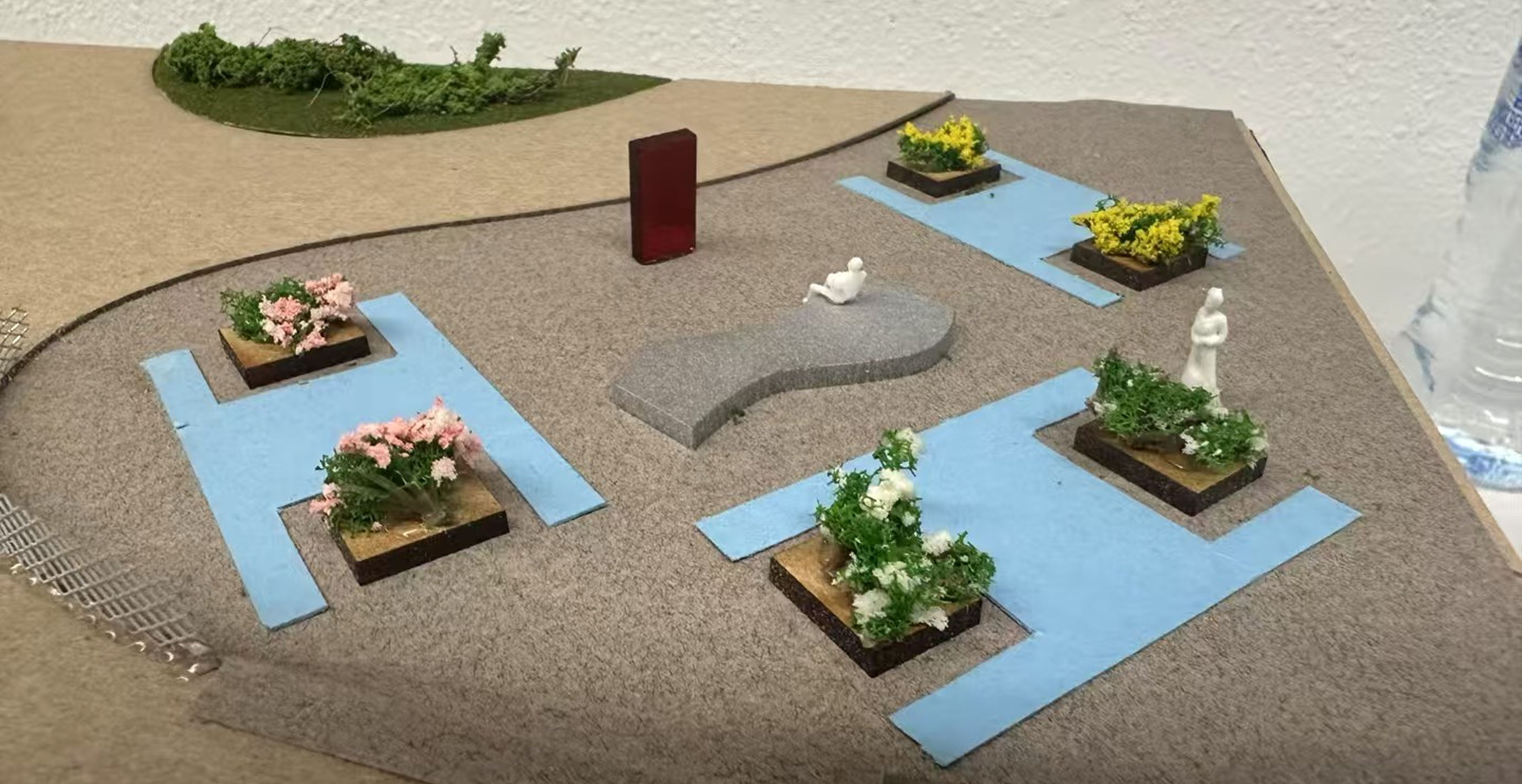
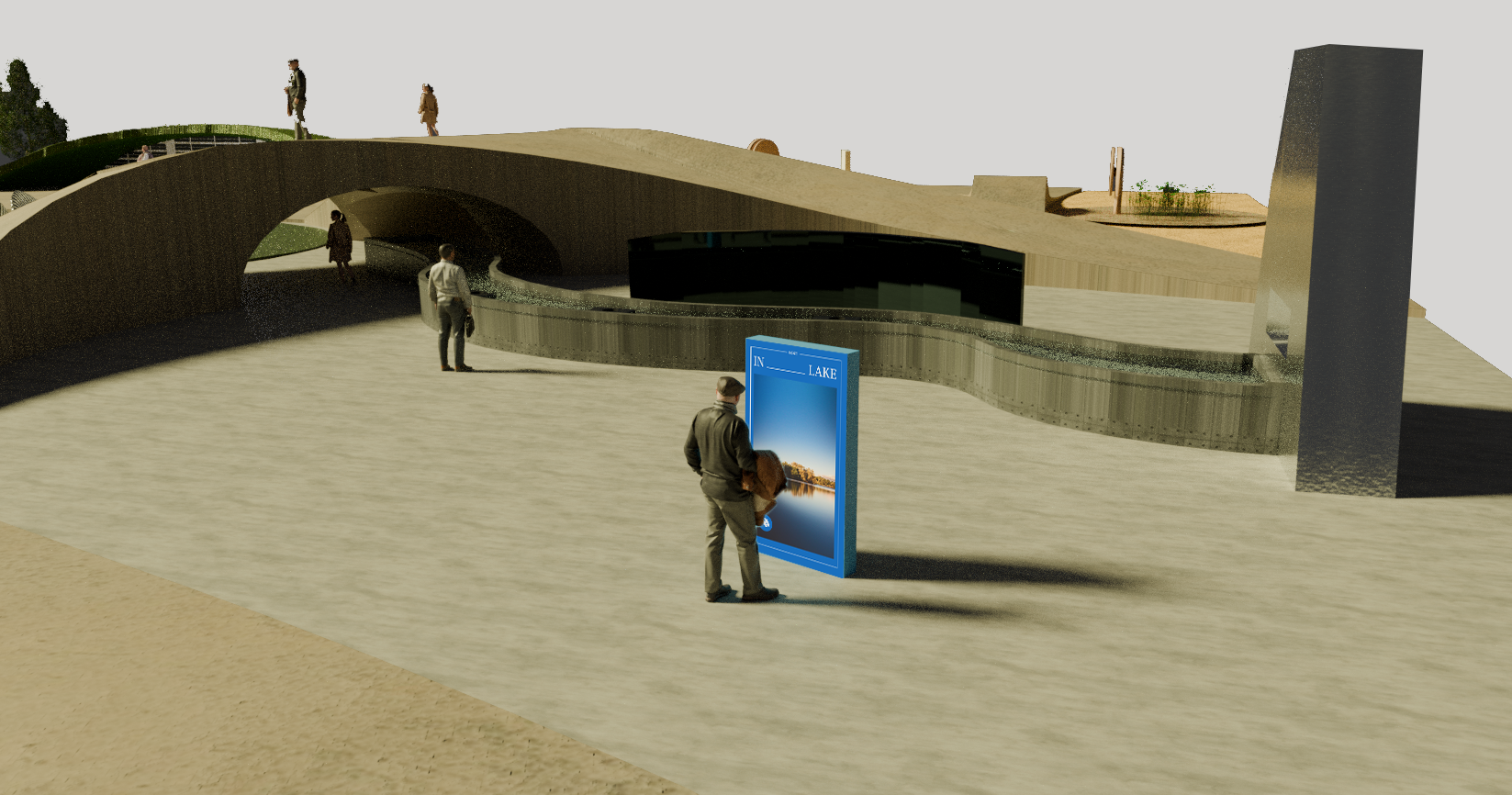
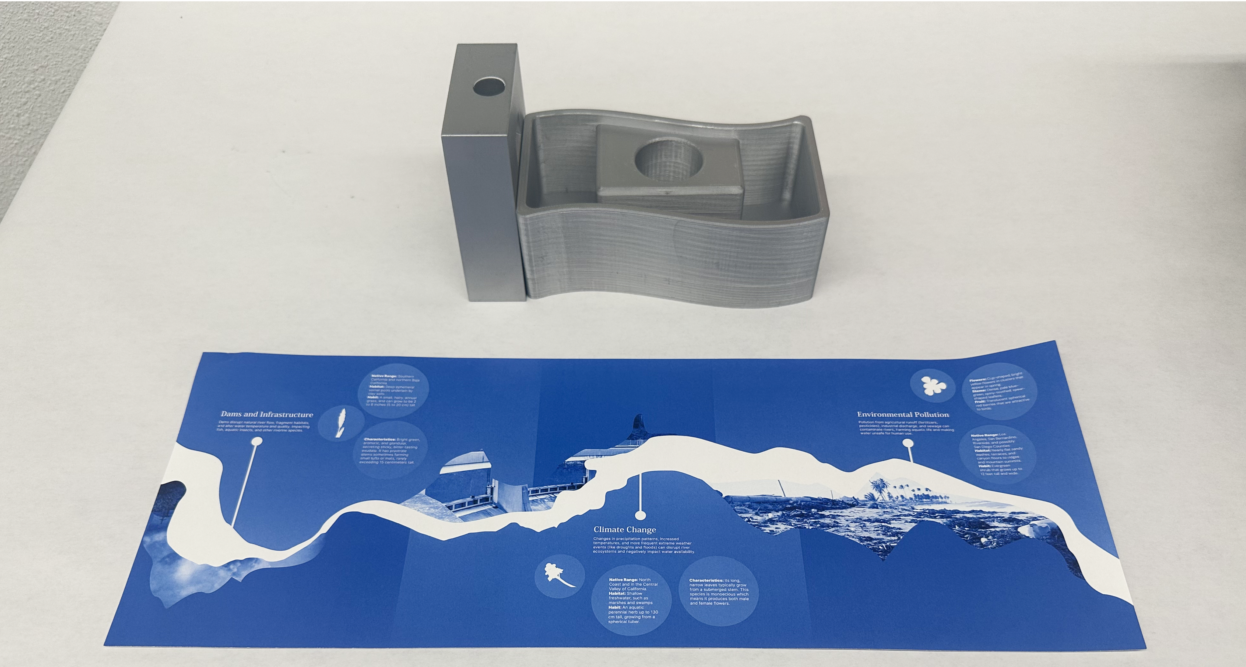
The park is divided into 4 zones: Forest, Wetland, Desert, and River. Each zone introduces 3 endangered plant spieces in the ecosystem due to urbanization and environmental destruction. Through introduction boards and interactive installations located in each zone, visitors can get a deeper understanding of nature and its importance to humanity, fostering connections and protection.
Forest Zone
![]()


Wetland Zone
![]()

Desert Zone
![]()

River Zone
![]()

︎︎︎ Installation 3D Printing & Information Design
︎︎︎ Promotion